Graph #
Graph opens a window that plots raster time series as monthly totals: for each month, the sum of all pixels. Use it to compare model outputs with observations, or to compare scenarios.
Use #
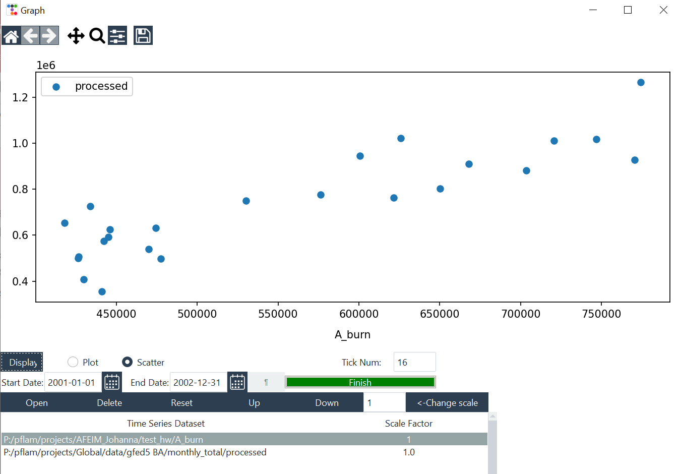
- Click Open and select a folder of rasters. Each folder becomes one series. Repeat for more series.
- Set Start Date and End Date, or click ¶ to load them from the configuration. Start on the first day of a month.
- Choose Plot (time series) or Scatter. For Scatter, first select a series in the list: it becomes the x-axis, and the other series are plotted against it.
- Click Display.
| Control | Description |
|---|---|
| Delete / Reset / Up / Down | Remove, clear or reorder series |
| Scale factor | Multiplies a series before plotting, for example to convert units. Select a series, type a value and click <-Change scale. Default 1. |
| Tick Num | Number of x-axis labels (default 16) |
| Toolbar | Reset view, pan, zoom to rectangle, subplot layout, save figure (PNG and other formats) |
How dates are read #
The tool reads the date from the first number with 4 or more digits in the file path:
| Digits | Meaning | How it’s plotted |
|---|---|---|
8 (YYYYMMDD) | Daily | Summed per month |
6 (YYYYMM) | Monthly | As is |
4 (YYYY) | Yearly | The yearly value is shown for every month |
| none | Constant | The same value for every month |
A 4-or-more-digit number in a folder name, such as
D:\runs2024\, is read as the date. Use folder paths without such numbers.
Reading many daily files takes time; 16 years of daily data took about 5 minutes in our tests. If you plot again with the same dates and folders, the graph is fast because data already read are reused.